Perspective Practice and Design
I’ve joined an internet forum where there are bi-weekly challenges, and the latest one was to draw a perspective heavy scene from a provided reference.
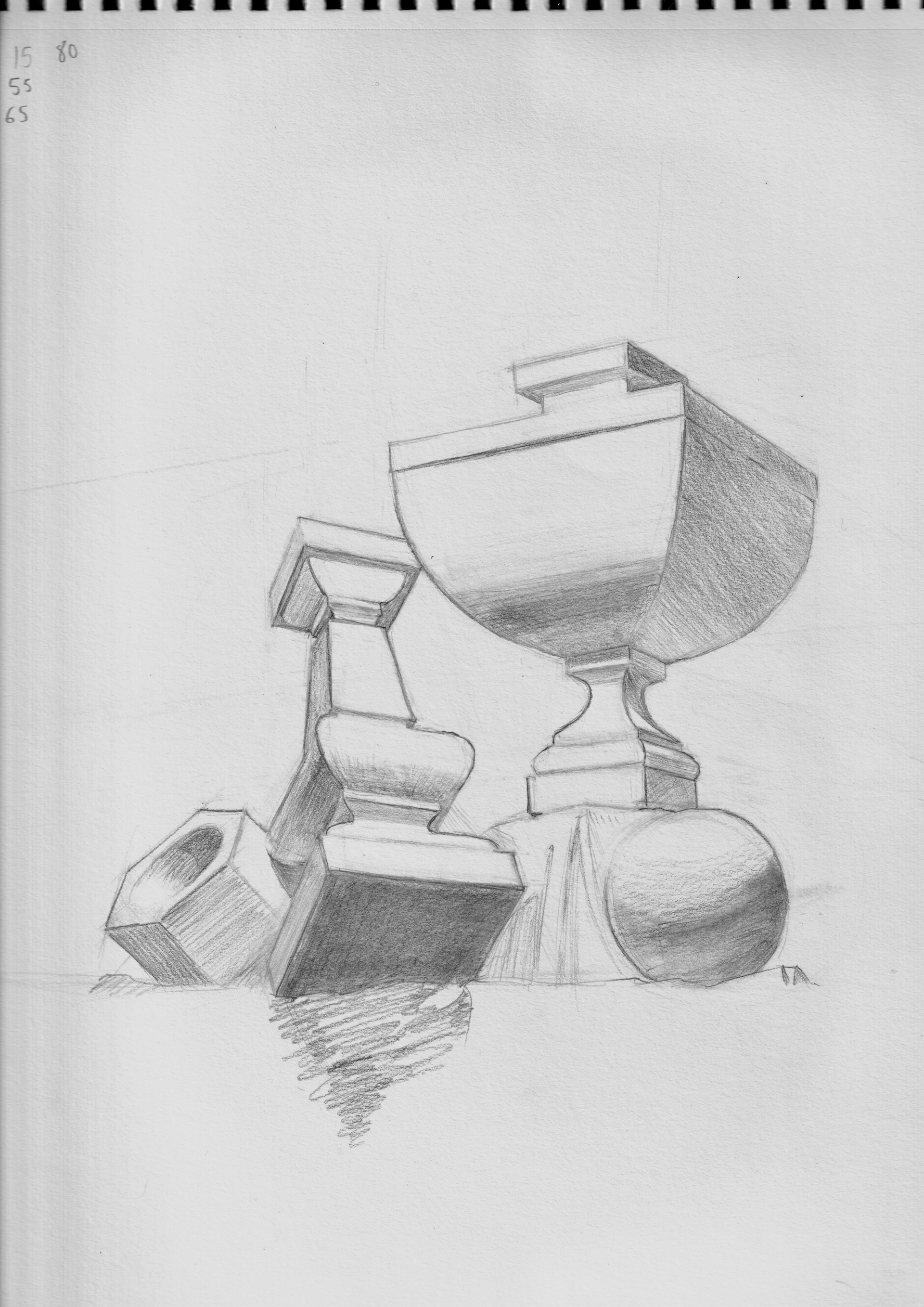
This might be my longest drawing at nearly 4 hours. Perspective is hard, and I decided not to use any rulers and hand jam everything. I do like how this turned out, and besides getting the perspectives (mostly) correct, I knew what I wanted to do to design this piece to look aesthetic.
I needed it to be clean. The problem I saw with some other submissions (or at least something I didn’t like) is that even if they had nice rendering, their lines were messy or lacked variety.
 The variety I speak of can be see among the objects above. I have keyed in lines, soft lines, and a lost line. The “keyed in” line is something I learned to do from a figure drawing instructor here in NY, and it’s where you create a dark mark to key in your value scale. You can see that I keyed in the corners of the base of the pedestal. I usually did these when the line bordered two contrasting values (light and dark), but some of that information isn’t there since there is no background. However, the key-ins create some variety and visual interest regardless.
Alternatively I have softer lines or lost lines where there is less value change. The top left portion of the circle is a lost line. The line isn’t there (except for erase marks), so your brain uses context to fill in the information.
Another lost line I like in this piece is the bottom portion of the hexagon’s intrusion, where the edge of the cut meets the hole.

And lastly, this lost line on the shaded side where the curve meets the flat.

My rendering (AKA shading) is still lacking. I can’t really even make a gradient or control my value scale, so that will be a greater focus for me in the coming weeks.